XR Designer - A prototype for an augmented reality design app
12 March 2022
With a group of four students, we developed an AR design app in collaboration with the Municipality of Eindhoven. We tested it on rented iPad Pros with very energetic children aged 8-16 in a nerve-racking workshop at a youth center. Luckily, the iPad Pros survived and we received the ASML Makers Award for our work.

The briefing #
In 2018, the Municipality of Eindhoven has created a pact for improving social-economic problems in Woensel-Zuid, one of the city districts of Eindhoven. It focuses on “creating opportunities for children and young people, encouraging entrepreneurship, improving climate resilience and tackling crime and safety related issues.”
In order to reach these goals, getting young people to care about and engage in improving their own neighbourhood was deemed beneficial. So, we were tasked with inspiring this younger demographic through “new methods and technologies such as gamification or digital tools.”
Because I was involved in the project, we inevitably landed on building an augmented reality design app, which would allow children to redesign their own neighbourhood. Participation sessions can be rather stodgy, so we aimed to make them more exciting by letting children run around the neighbourhood with iPad Pros. What could go wrong?
Design #
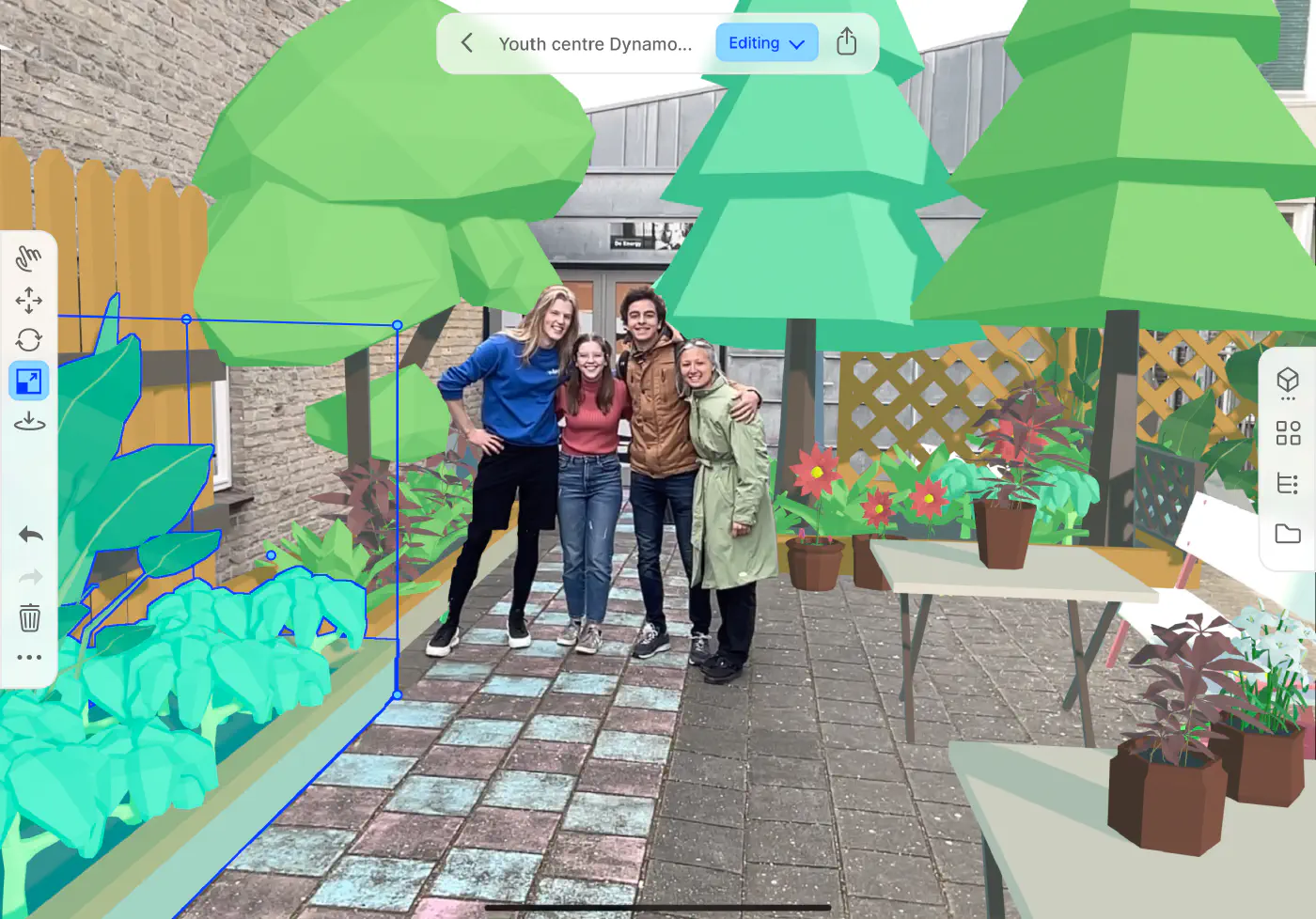
The goal of the design app was to give as much creative freedom as possible, while still allowing children to create something beautiful in under 15 minutes. To achieve this, the app contains a library of common objects, which can be placed in the world in any way.
After making some rather optimistic mockups in terms of the attention span of children, we settled on a double approach: easy to pick up for dragging and dropping some objects, but still enabling full editing functionality if you explicitly look for it – I just didn’t have it in me to design something that does not allow full control:


Hacking together a prototype #
I built the prototype in a very structured manner, employing clean coding standards, good abstractions, a beautiful custom event system for handling touch input and implemented object transformations using my newly learned linear algebra-chops – and then all of a sudden the deadline was next week. Fuck.
I had initially planned for the object library to be a full blown file browser, but I severely underestimated this task because I did not have a proper UI framework to build on top of. Yes, I’m looking at you Unity.
On that note, I even spent an entire week reverse engineering the inertial scrolling behaviour from iOS, because Unity’s UI scrollview implementation is incredibly janky. It naively uses the average speed accross the last five touch positions for the inertia on releasing the scrollview, which feels too slow. Additionally, polling is used for the touch events instead of native callbacks, which means touches get lost. Finally, rubber banding is calculated by multiplying the speed with a constant instead of a physically correct damped spring-simulation, such as in iOS. These three things result in a sluggish and non-native experience for the user, which I wanted to avoid. Through sheer persistence I managed to match iOS’s inertial scrolling and rubber banding 1:1. I was in ecstacy and fist pumped my way through the room. I even have a video to prove it. (Not of the fist pumping, but of the scrolling behaviour working.)
But I had to scratch all that…
I spent three days hacking together a horrible object library, only barely going beyond hardcoding the positions of the UI elements in the panels. I felt ashamed and dirty. Noone was to ever see this code. But it worked.
I learned my lesson: first get the bare minimum working, then make it better. Don’t start out trying to build something perfect. The software will stay in a somewhat demotivating perpetually unfinished state, eventually resulting in the (sub)project getting abandoned.
Help, the children are running around with our iPad Pros! #
With the prototype hacked together, we got in contact with a local youth center to test our app in the wild. Using our app, children would redesign their courtyard into whatever they could dream of. We got an architect involved who would incorporate the wacky designs into something achievable. We love a floating super-treehouse-rocket-base-with-integrated-waterslide as much as the next guy, but apparently we couldn’t spend the entire national budget on this one.
For the workshop we used my own iPad Pro and multiple additional rented iPad Pros. After a brief introduction, the children got handed the iPads. We stood in the courtyard, in anticipation of what the children would do, and felt our smiles quickly turning into nervous laughs once we saw them running with these €1000+ devices.
But they were having fun! So we did not intervene, only providing some tips on how to reset the scene, or how to move an object up and down. (And maybe to reset the app due to a bug in the hacked together object library.)


Reflections and ruminations #
The good #
It was a joy to see children pick it up so easily, and seeing my creation come to life was a deeply rewarding experience. No amount of arbitrary internet points comes close to it. All worries about whether it would be good enough, or the fact that I didn’t manage to implement that one feature in time, went away immediately.
Putting your unpolished, unfinished product in the hands of users is scary. You somehow expect them to bash your programming skills. You expect them to scold you for using Unity instead of a proper framework. But they don’t. So get your product out there and let it fail. You’ll learn more from that than you could ever learn from ruminating in your ivory tower.
The bad #
On the other hand, testing an augmented reality app in an unknown environment after a long development process where you’ve only tested it in small indoor spaces is not a great idea.
Augmented reality on the iPad Pro is in a rough state. Good enough to support use cases such as placing some objects within a small radius or adding some filters to the world, but not nearly good enough for a world-scale design app:
Tracking is only accurate if you stay within a 3 meter radius. Beyond that it will randomly start drifting 1 meter in any direction. If you walk back to your original position, it might snap back. But then your newly placed objects are all wrong.
Next to this, for a convincing augmented reality experience, you need occlusion. Otherwise your objects just float in space. But the occlusion provided by the iPad Pro is bad. It only uses the LiDAR scanner, which has a low resolution, low range, and produces many artifacts. If you use the raw output of the sensor, it will glitch, flicker and in general be unreliable. No amount of filtering will solve this.
Evidently, solving occlusion and tracking at a low cost is incredibly hard, as we see even a company like Apple struggle to provide a usable solution for consumer devices.
There are more problems, such as semantic scene understanding and localisation beyond relative tracking, but these are less fundamental problems to providing a compelling augmented reality experience.
All in all, augmented reality is simply not good enough yet for practical applications beyond tabletop games and fun filters.
The ugly #
In addition to pure technical limitations, who is actually going to pay for this? Instead of having students create a single-use fun prototype to forever forget afterwards? Does augmented reality solve a real business need? Or is it a nice-to-have cost center that will get cut the moment monetary excess dwindles?
Is it only fit as a fun gimmick for a mass-consumer game as Pokemon Go or some tabletop experience? Or as a mere marketing tool for on your cereal package? Reduced to a product preview or kitchen configurator, devoid of any passion or creativity?
But the dream persists #
Even with these technical limitations and potential lack of business viability, the dream persists:
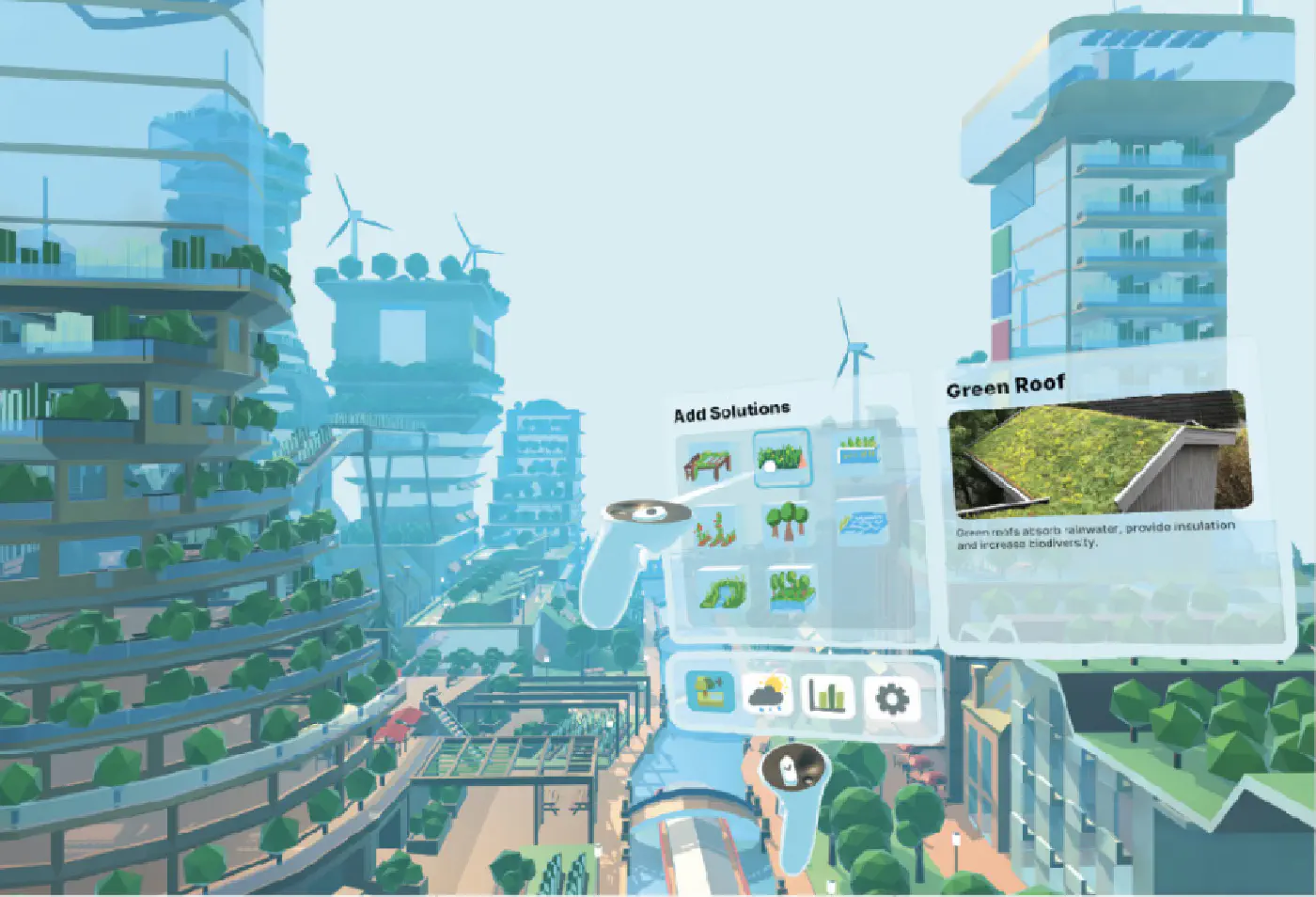
The dream is to be able to use augmented reality as a creative tool, instead of as just a target platform for games and filters. I want to be able to redesign the world. I want to show how much greener, more walkable and liveable we could make our cities, offices and homes. How much more beautiful we could make the environment we live in every day. Because we have become used to the ugliness around us. Augmented reality allows us to look at the world with fresh eyes. Where a picture says more than a thousand words, augmented reality says more than a thousand pictures. Once you see what could become, you’ll fight for it to become reality.
The dream is to be able to use augmented reality as a creative tool, instead of as just a target platform for games and filters.
I don’t want Reality Composer, Adobe Aero, Lens Studio, Spark AR, Unity and the endless stream of low-code web platforms to be the best things that exist in this space. I want a true creative tool that allows me to create in AR.


